#VisualizeChange: Technology for a Change
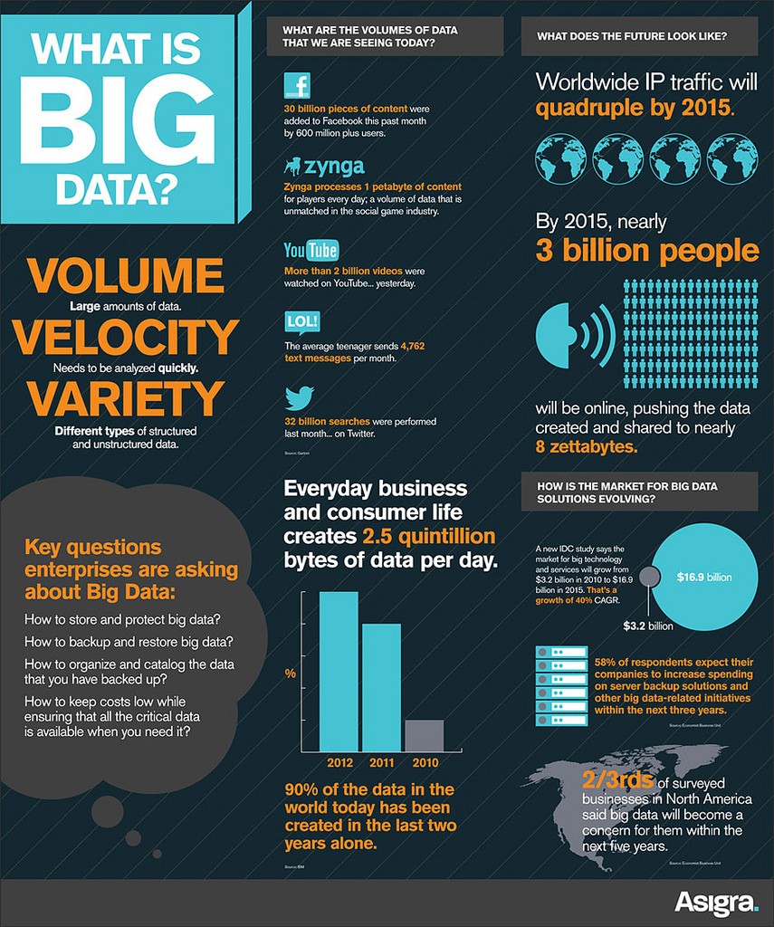
“If we don’t look at data, we underestimate the tremendous change,” once said infographics guru, Swedish Professor Hans Rosling.The first-ever World Humanitarian Summit (WHS) initiated by UN aims at gathering people from all walks of life who look at data and transform it into visuals. Bring statistics to life with digital tools and get a chance to present it at the Global Consultation in Geneva, Switzerland in October 2015.
The WHS has its Master Data Catalogue that includes around 500 documents generated throughout the consultation process. Documents present emerging topics and suggest a direction for discussion and data analysis. These include empowerment of affected communities, gender issues, protection of people in conflict, risk management, response to finance gap etc. Description of #VisualizeChange, the list of themes and useful external sources are provided here.
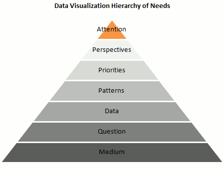
What happens if we imagine data visualization process as Maslow’s pyramid of human needs hierarchy? Before starting to work with data, you might want to ask yourself a couple of questions.
Here are a few good resources that can help both in the #VisualizeChange challenge and in data illustration in your daily practice:
Leaflet (to develop mobile-friendly interactive maps)
D3.js (to manage documents based on data)
Tableau Public (to publish interactive data to the web)
Datavisualization.ch (a selection of different tools)
In addition, “22 Free Tools for data visualization and analysis” should be handy both for beginners and IT experts alike.
Who can participate in the WHS challenge?
Any individual or any organization that can visualize information based on topics of the WHS is welcomed to send an entry until 30 August 2015, 11:59 PM GMT. You can propose your solution here.
Plus, for inspiration have a look at Hans Rosling’s illustrious TED talk on statistics and changes globally:
Image via Flickr
 New PhD opportunities at the University of Leicester
 Call for Abstracts: New Directions in Media, Communication and Sociology (NDiMS) Conference
 Ørecomm Team to Gather at the University of Coimbra
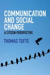 “Communication and Social Change – A Citizen Perspective” Published
 C4D Network to Sum Up Global Communication for Development Practice
 Entering Media and Communication into Development Conferences?
 IAMCR Conference 2016: Communication for Development Highlights
 Glocal Classroom Revisited – Storytelling & Social Change Leicester-Malmö
 I EvalComDev International Conference: Call for Papers
 Looking for Media and Communication in Development Conferences: Devres 2016